MyCourses: Redesign leading to 1.75X faster assignment uploads.
A sleek redesign with dark mode, seamless navigation, and easy access to all resources, making coursework faster and simpler.
Helping students spend less time navigating and more time learning.
- User Research
- UX Audits
- Journey Mapping & User flows
- Hi-fidelity Prototype
At A Glance
I surveyed 10 students to identify their primary tasks on MyCourses and the challenges they face, from tracking deadlines to finding content across inconsistent course layouts.
Mapping user journeys and pain points revealed key opportunities to improve clarity in two critical areas: accessing course content and managing assignments.
I redesigned key screens like the dashboard, assignments, and grades to improve visibility, consistency, and access.
Through iterative prototyping and usability testing, I refined the interface to better support task flow and mental load, with faster assignment uploads and content browsing.
Motivation
I often found myself digging through folders just to find a single slide or assignment. It wasn't always clear where things were placed, and many of my classmates faced the same frustration. Navigation felt scattered, the layout outdated, and key actions harder than they needed to be. It became clear that the system needed a more intuitive experience.
Design Process
Skip to solutionUnderstand the Platform and its Shortcomings
Research User Patterns, Goals, and Frustrations.
Rethink the Existing Architecture and Flows
Visual Design and Prototyping
Measure the Impact
1. Understanding the platform and its shortcomings
What is MyCourses
A learning management system (LMS) used by students and instructors to manage and engage with course-related tasks in one central platform.
Key features include:
- Accessing lecture content and resources
- Submitting assignments
- Tracking grades and progress
- Viewing deadlines and announcements
- Communicating with instructors and peers
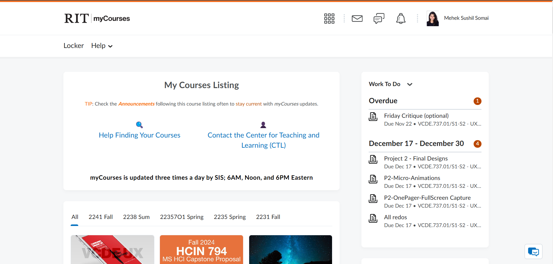
Initial Observations from the Current Design
I tried to analyze the the design of the platform and made some key observations. Important information like courses and assignments was hard to find, while less useful content took up too much space.
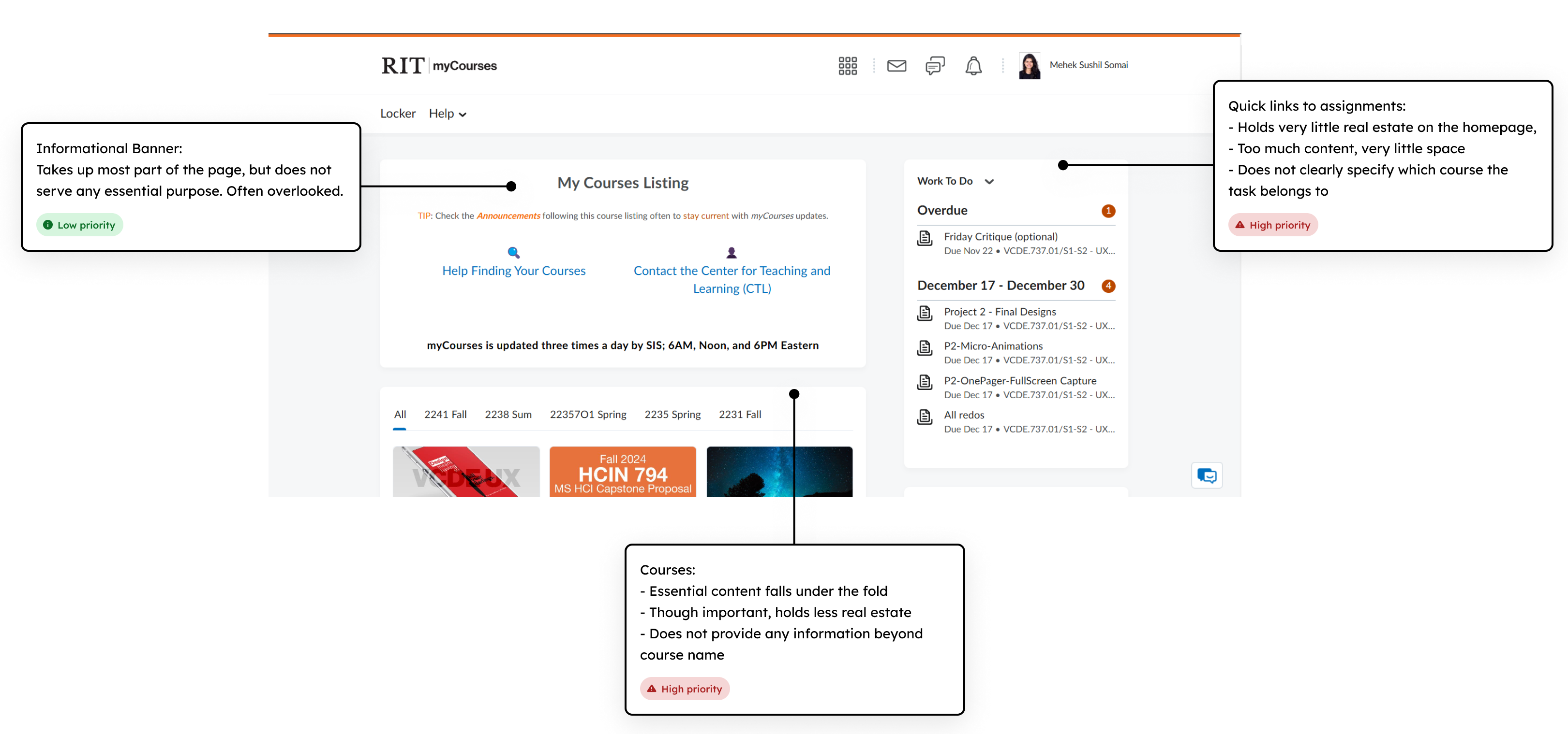
Key Friction Points
Content Overload
Instead of immediately showing the enrolled courses or tasks to complete, users are overwhelmed by secondary content that distracts from their primary needs. This lack of clear focus makes it difficult to identify what to do first, leading to frustration and wasted time navigating through irrelevant information.
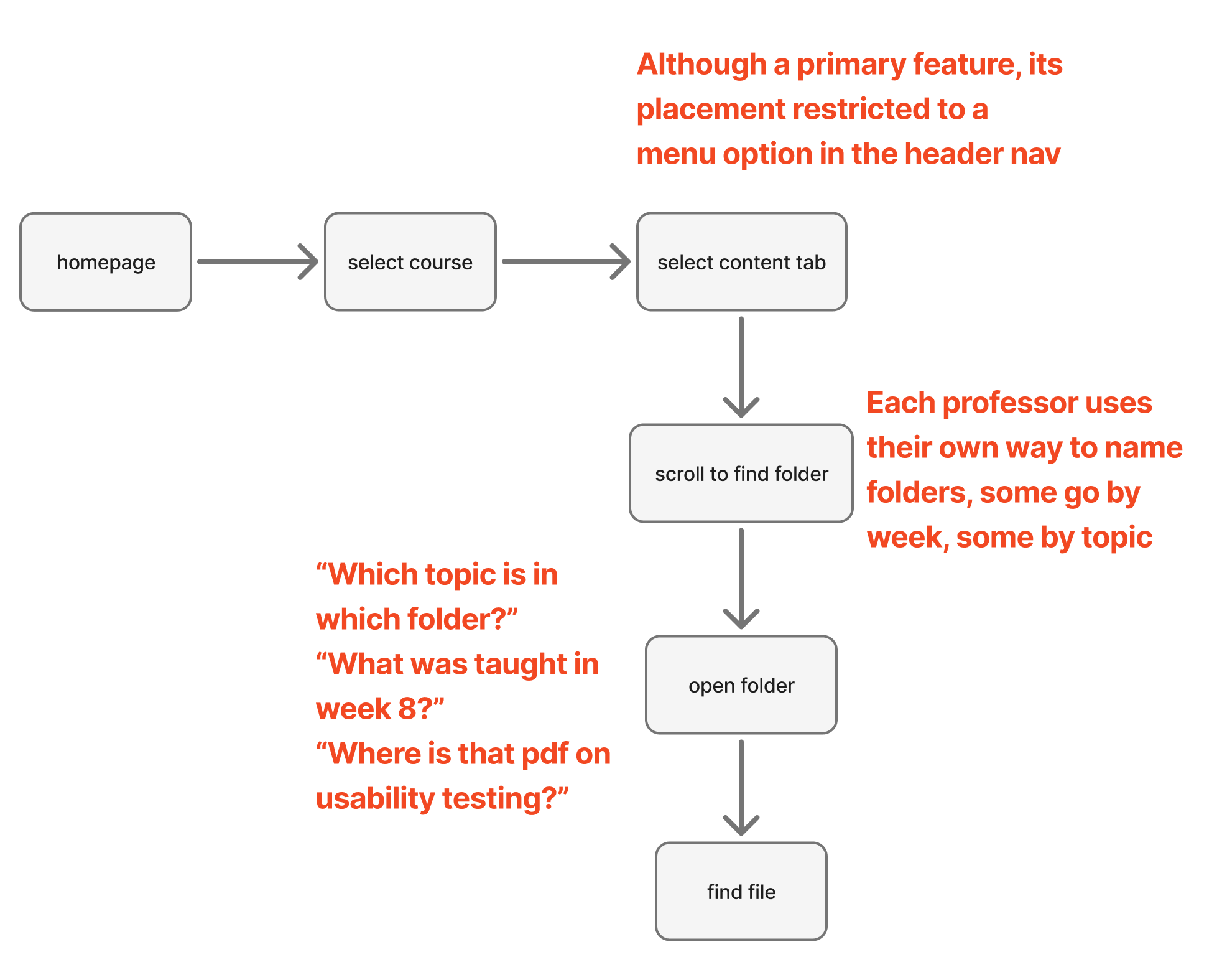
Hidden Information & Extra Steps
The course overview page, for example, fails to provide users with essential details upfront, forcing them to rely on the header navigation to locate specific content. This adds unnecessary steps to their workflow, making it harder to find materials quickly. Additionally, the page does not highlight newly added content, leaving users unaware of updates and requiring them to manually search through multiple sections.
2. Research user patterns, goals, and frustrations.
User Survey
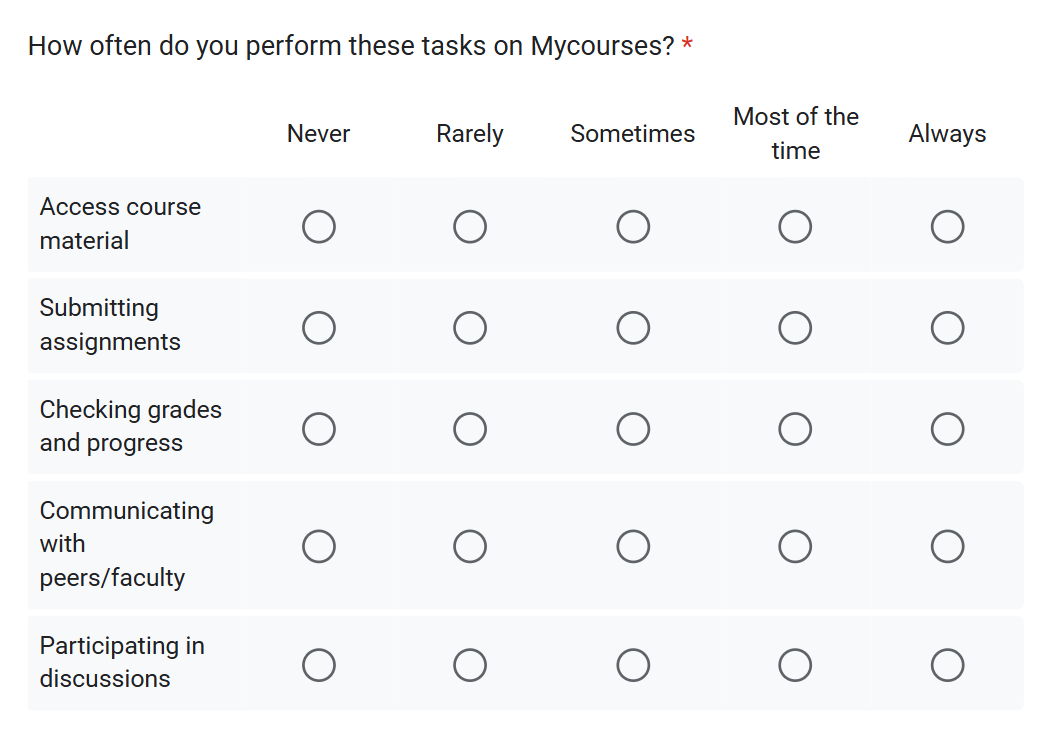
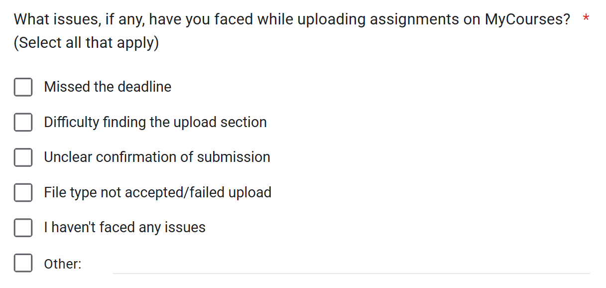
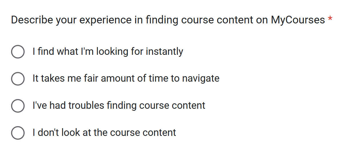
With limited time and the need to reach a broad group of students, I conducted a survey. It helped me quickly gather insights from a larger audience and spot common patterns in how students interacted with the platform.
objective questions
subjective questions
Survey Findings
Students commonly described the UI as outdated, cluttered, and overwhelming to navigate.
The survey showed that students often had trouble finding files, keeping track of deadlines, and knowing where to look for assignments or grades. Content was spread across different sections, and each professor organized things differently, leading to confusion and missed tasks.
Most used features were:
- Submitting Assignments
- Accessing Course Material
% struggle to find course content due to poor oganization.
% are frustrated by extra steps required to access new materials
% find uploading assignments confusing due to seperate sections
"If i want to view specific class lecture ppt but i dont remember which week it was from, i have to go through the notes from all the weeks to find it"
"The UI could be simplifies and have a fewer interactive steps to access any course material in the catalogue."
"Upload link is separate and submission/uploaded files section is separate, causing accidental clicks"
"Feels like website has not been updated from 20 years"
User Persona

"If i want to view specific class lecture ppt but i dont remember which week it was from, i have to go through the notes from all the weeks to find it"
Aanya, the Seeker
- Quickly find class materials without excessive searching.
- Simplify the process of uploading and submitting assignments.
- Struggles to remember which week specific lecture notes or files belong to.
- Confusing and separate sections for uploading vs. submitting files.
- Overly complicated steps to access course materials.
Design Goals
Simplify and fasten assignment submission.
Never miss a deadline, or spend too much time trying to find the submit link.
Super quick access to content.
Find the right content, at the right time, without getting lost in navigation.
3. Rethink the Existing Architecture & Flows
Task 1: Finding Course Content
BEFORE: The original flow has a minimum of 4 steps to complete the task
 Old user flow diagram with barriers
AFTER: Reducing it to a minimum of 1 step, and maximum of 3 steps
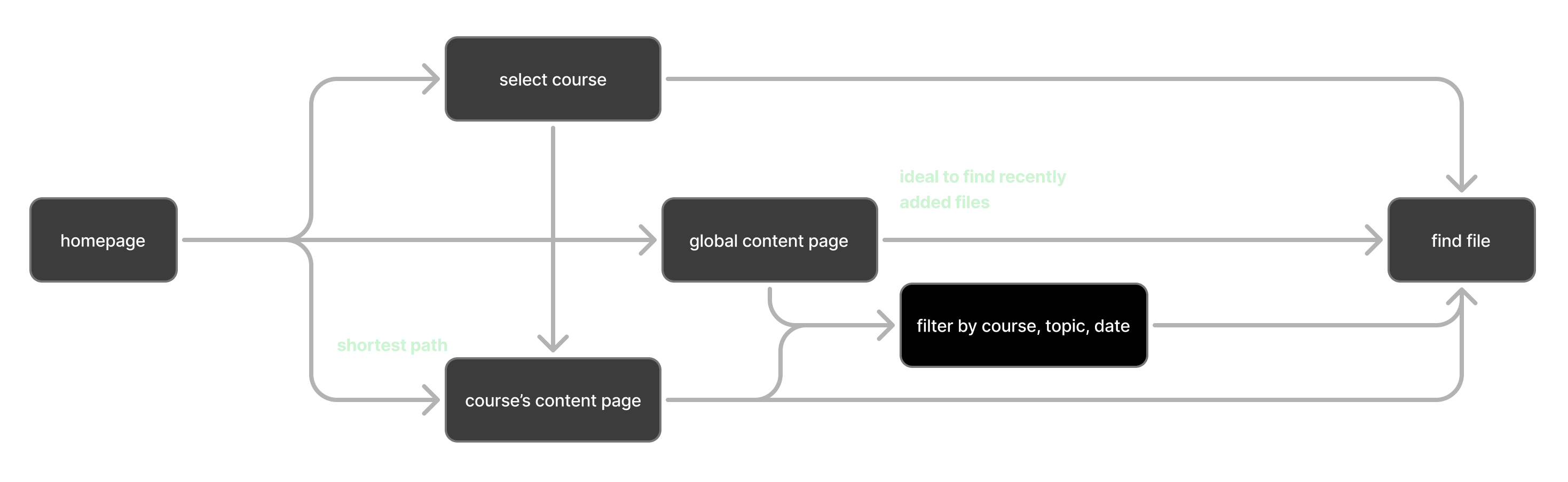 New user flow diagram for content
Task 2: Assignment Submission
BEFORE: The original flow has a minimum of 4 steps
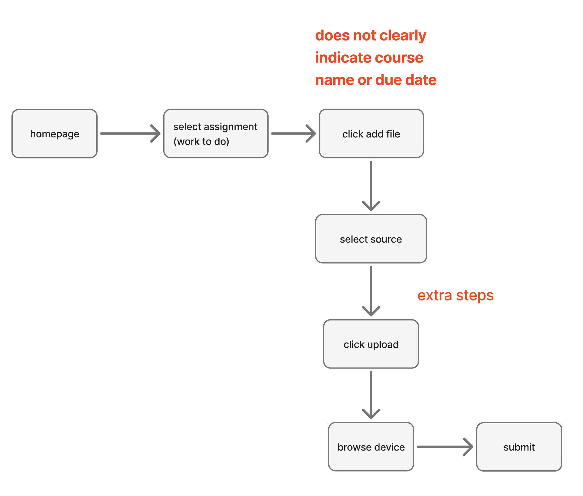 Assignments user flow diagram with barriers
AFTER: Reducing it to a minimum of 2 steps, and maximum of 4 steps
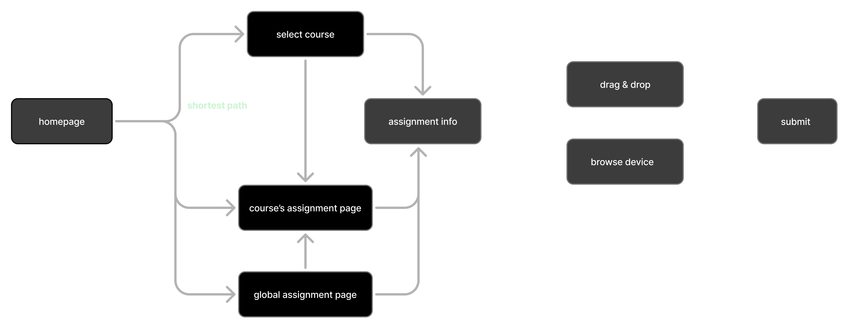 New user flow diagram for assignments
4. Visual Design & Prototype
User Feedback & Visual Style
Direct quotes from the survey responses revealed frustrations with the outdated interface and desire for modern features like dark mode. The visual style word cloud represents the most common themes and preferences mentioned by students and my own perception of the redesign.
"I'd love a dark mode! For night studying possibly"
"Feels like website has not been updated from 20 years"
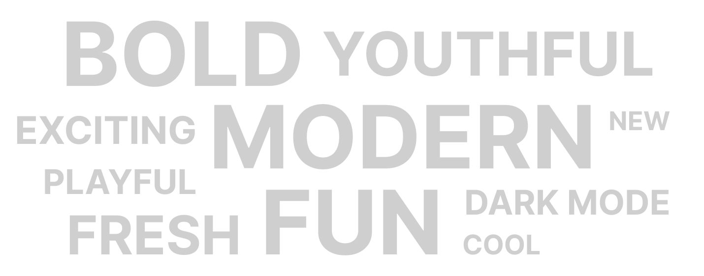 Visual style word cloud
Initial Design Attempt
- Courses hold the largest visual priority, essential information directly visible.
- Assignments nested within each course immediately informs the user.
- One click route to recent assignments and new course material
- Color coded tags for assignments help prioritize tasks.
- UI still looks outdated
- Having course material and assignments within one card makes it cluttered
- Assignments is not given priority
Revised Design Style
- Each course has a quick access menu for assignments, content, grades, announcements and discussions.
- Rounded edges and dark mode make the experience modern, youthful and fresh.
- Assignments are present in overlapping cards, with due date highlighted and color coded.
- Overall less cluttered and intuitive.
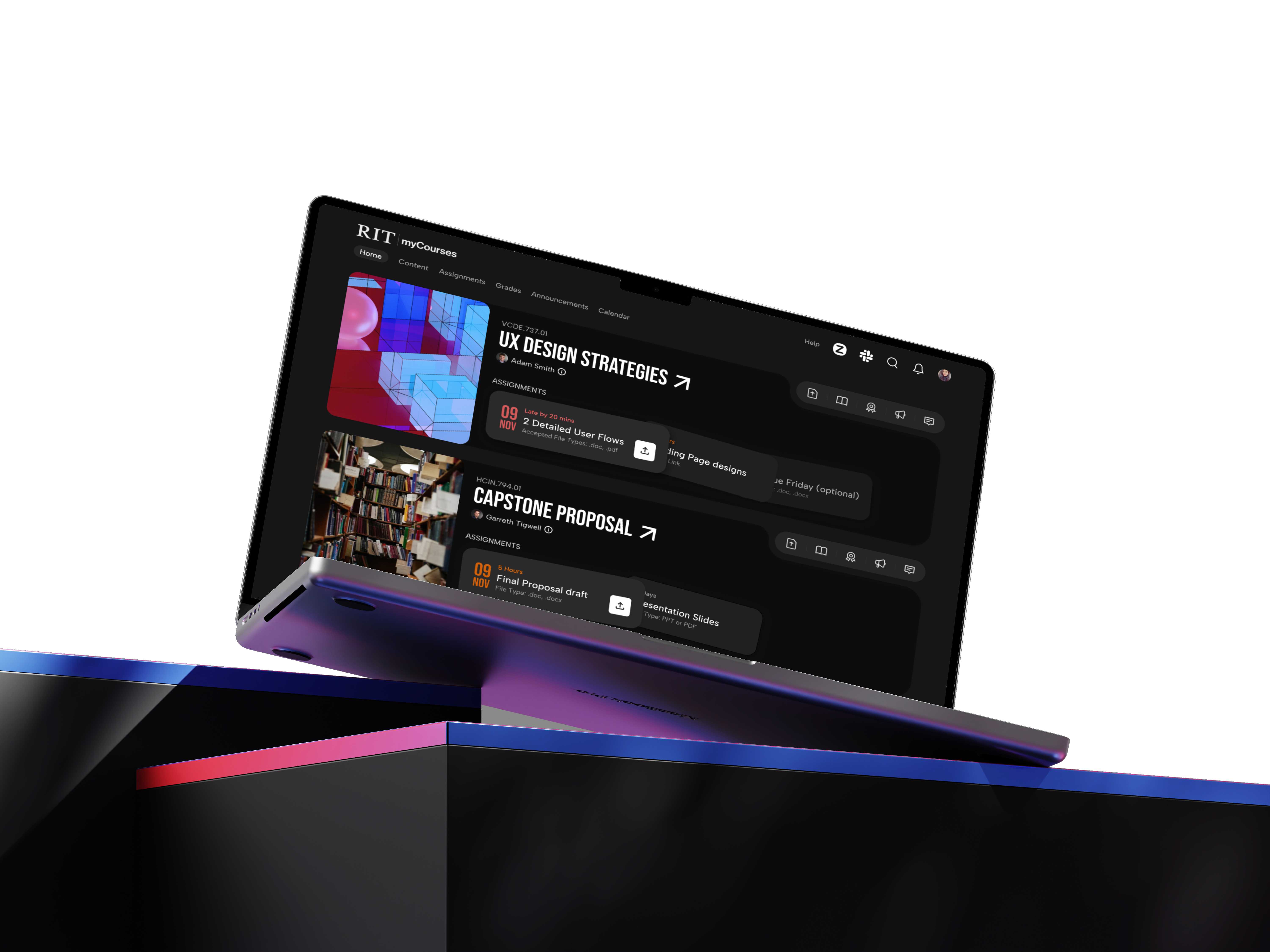
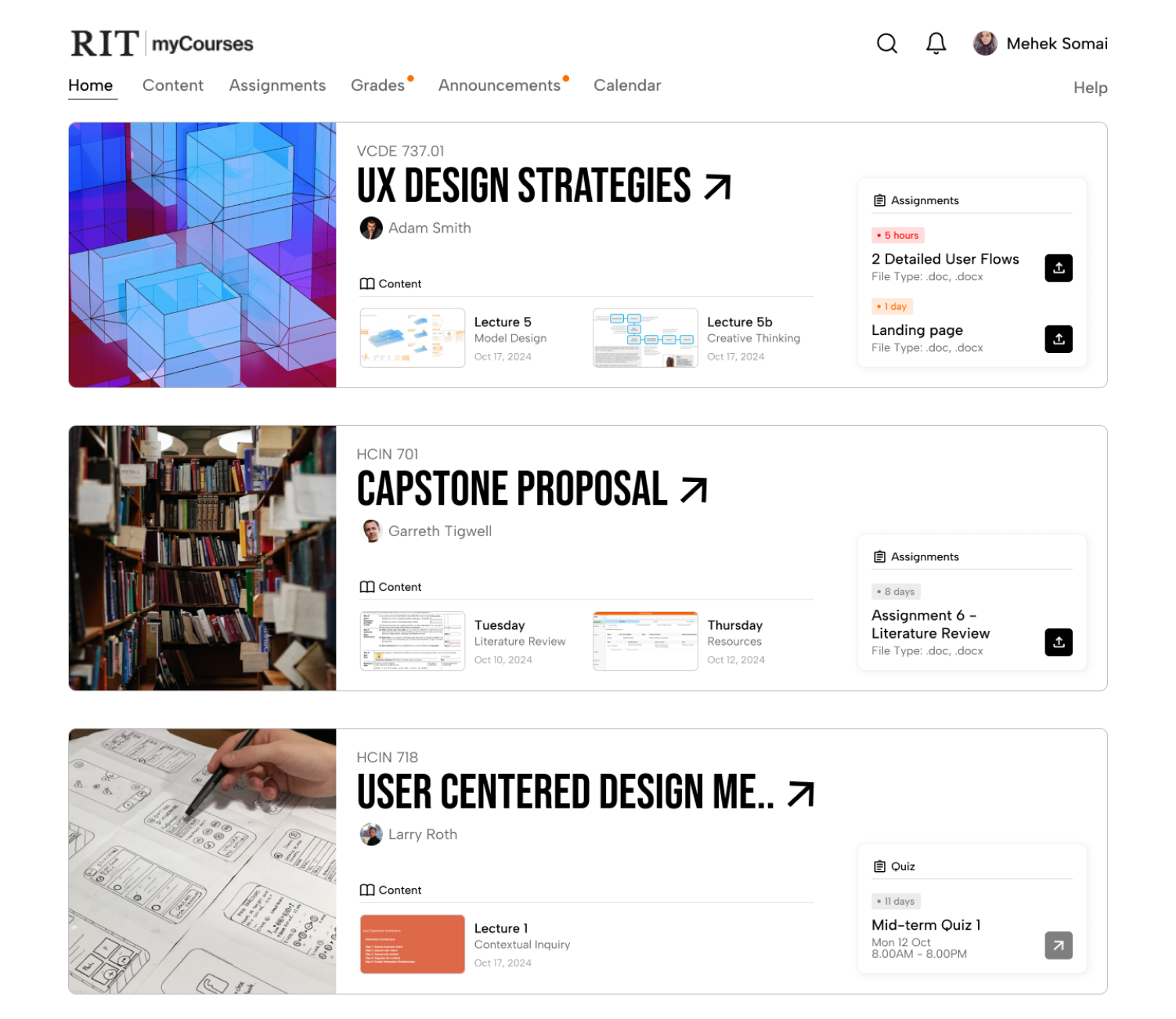
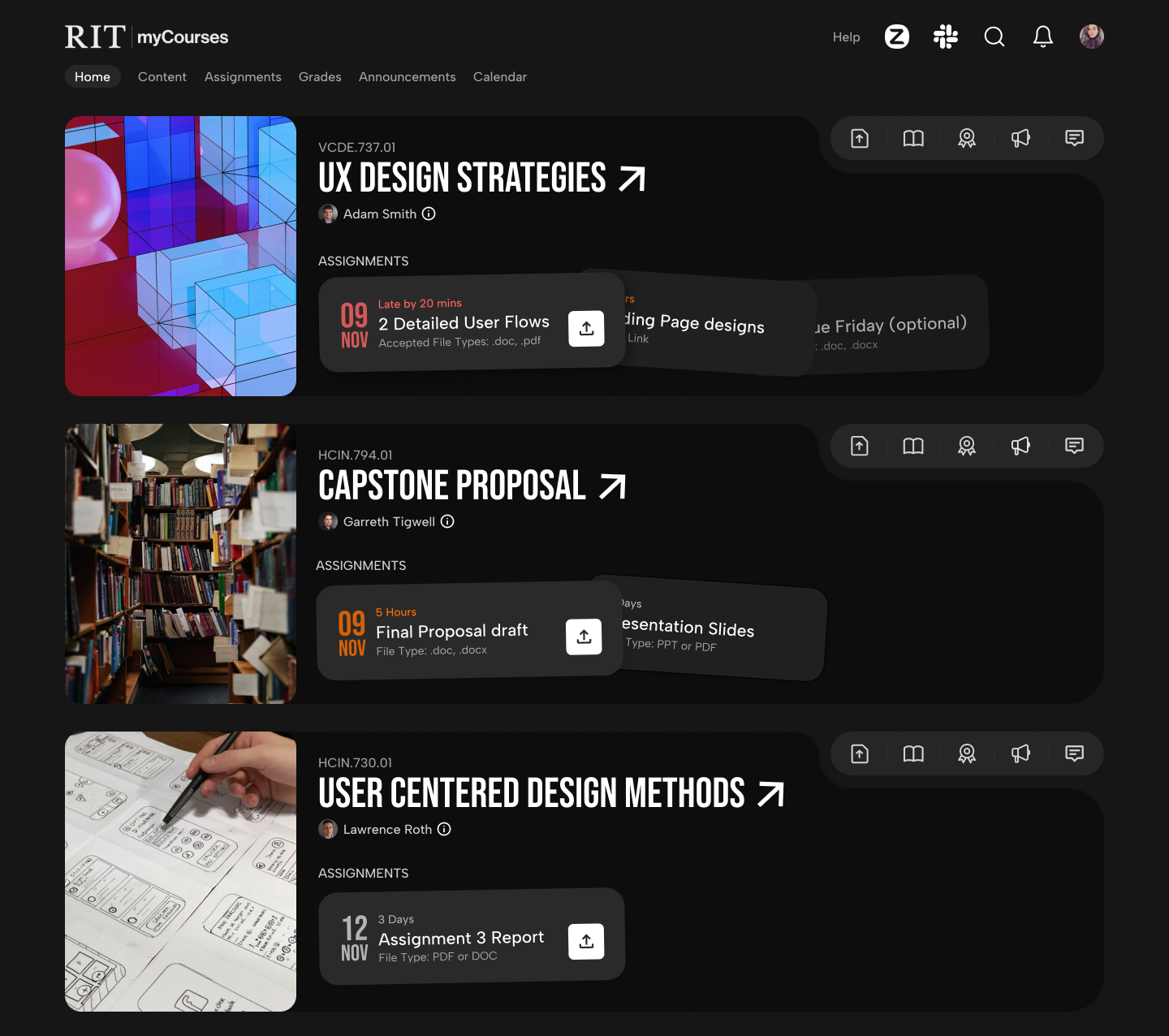
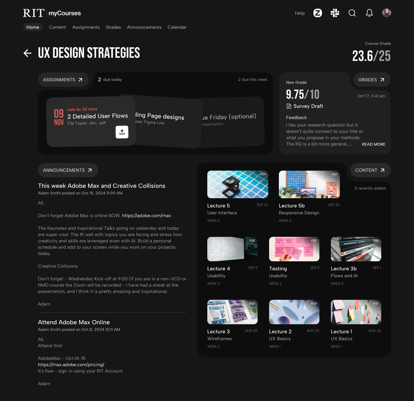
Final Design Solution
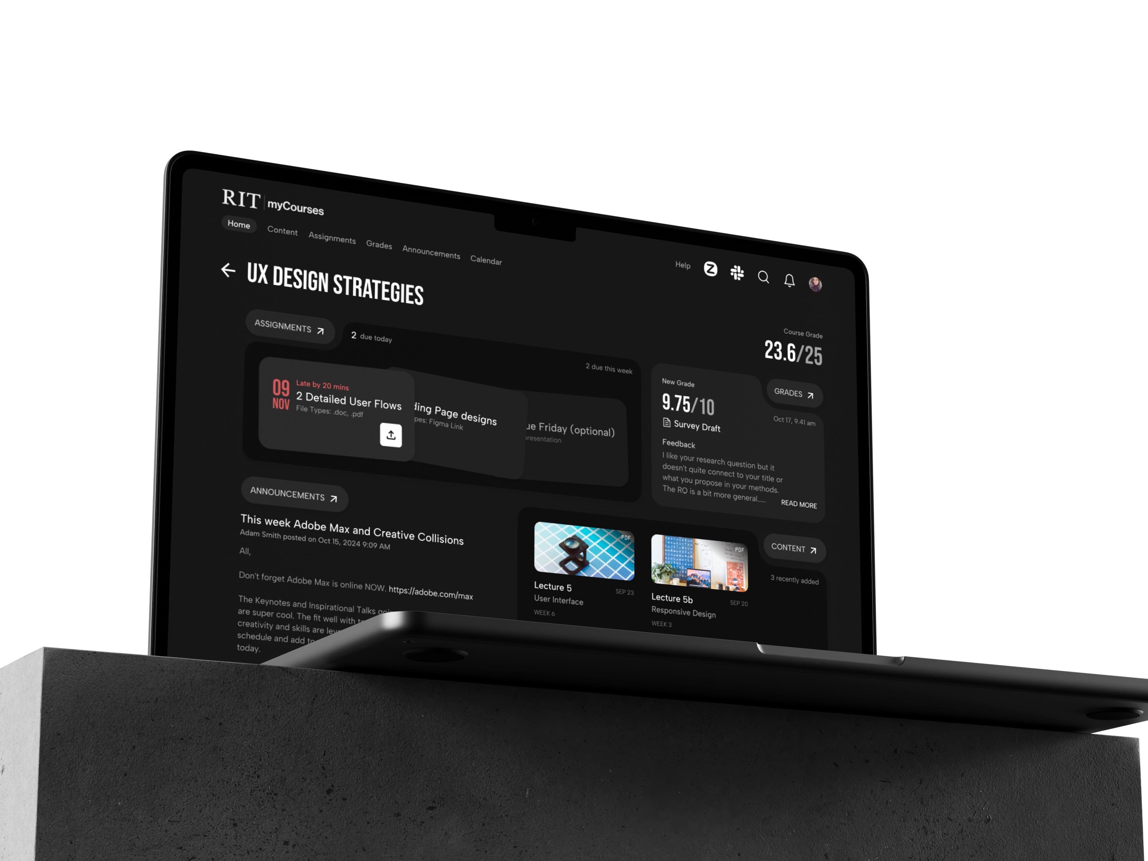
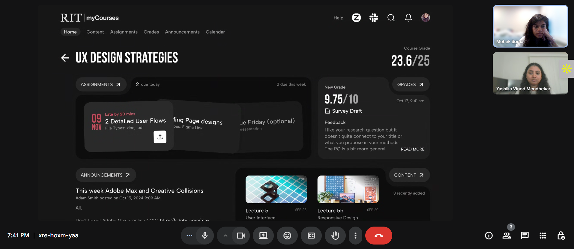
1. Super Quick Access to Content
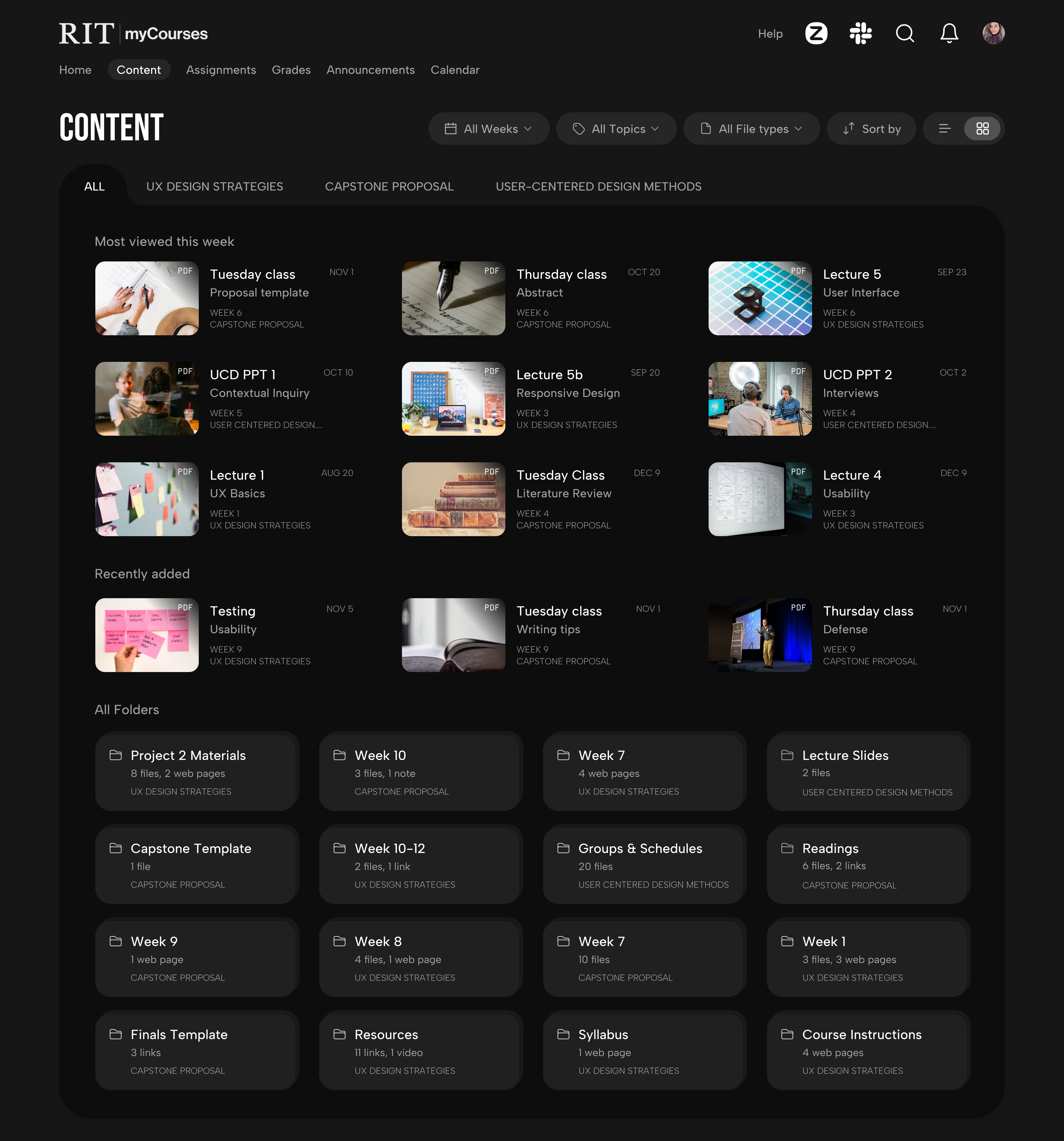
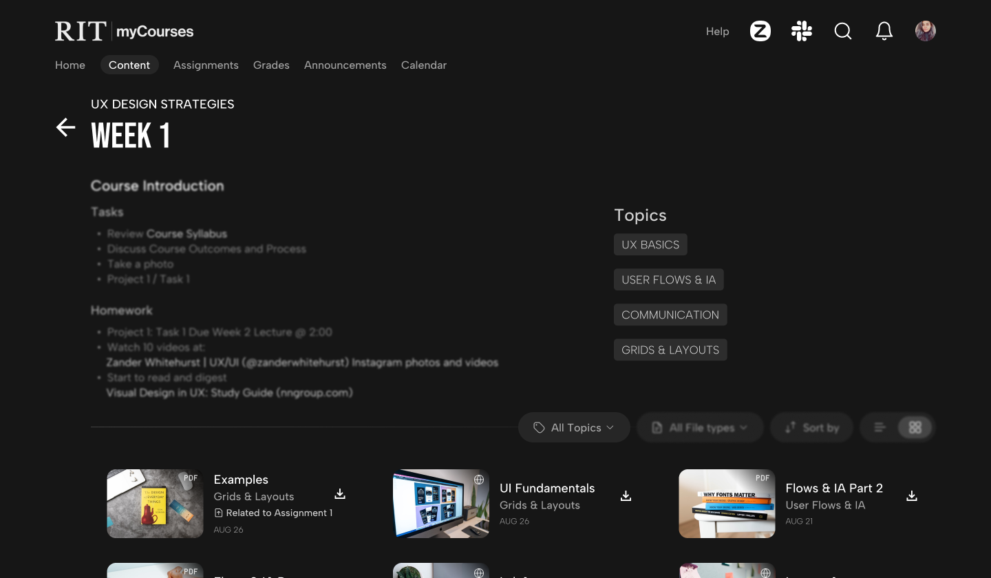
Global Content Page
- A content-only page with appealing thumbnails for easy identification and recognition.
- A 'most-viewed this week' section to view what most students are reading at present to stay aligned with the class.
Aanya's frustration with the overly complex routes to find content can be improved."It's confusing because every professor has different places where they upload content or assignment details"— Survey Response
Content Preview
- The course overview page highlights recently added content, so students can instantly find new content.
- This section also has a link to the main content page, where all content and folders under that course can be accessed.
"I wish there were fewer interactive steps to access any course material in the catalogue."— Survey Response
Filters
- Filter through content based on time, topic discussed, file type, and various sort options.
- Optional list view to skim through larger content at once.
Topics
- As professors upload files, the system auto-tags each with a 'topic' based on its content, so students instantly see what the file is about.
- Students can view all topics discussed in a particular week and also find content based on the topic.
Aanya can use filters to search for the particular file based on what was taught, instead of tedious scrolling. "If i want to view specific class lecture ppt but i dont remember which week it was from, i have to go through the notes from all the weeks to find it"— Survey Response
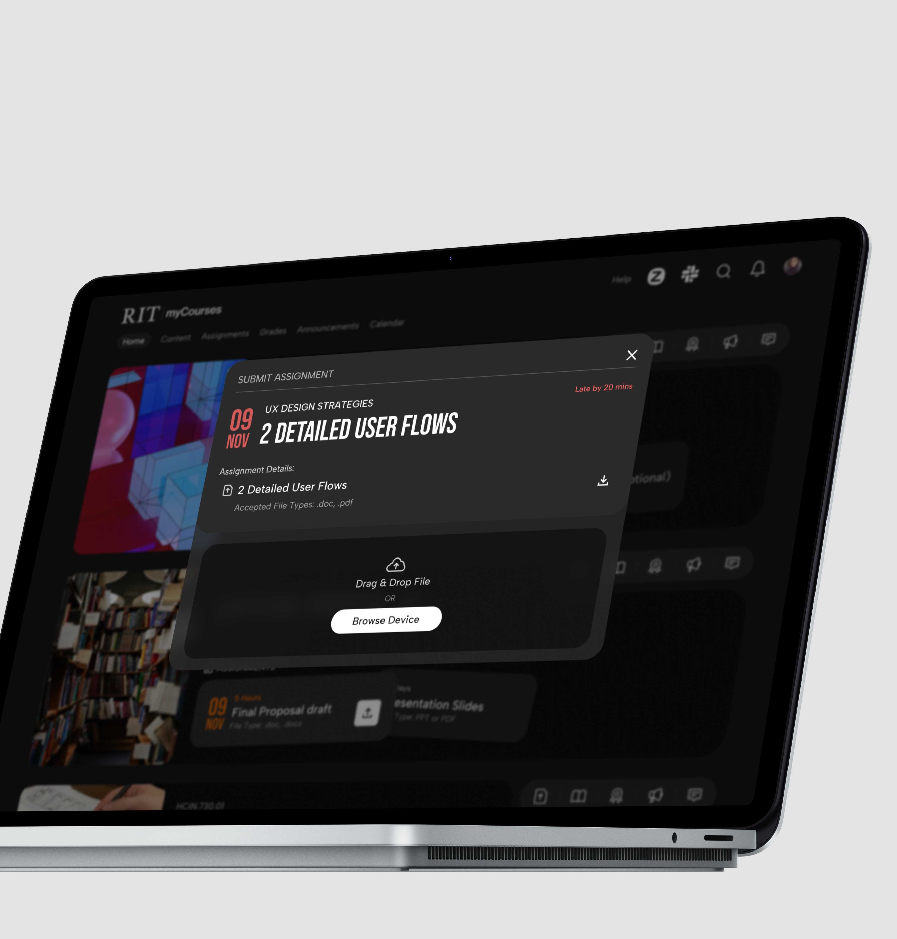
2. Simplify and Fasten Assignment Submission.
One-click Submission
- 44% students either missed a deadline, or could not find the link to upload files.
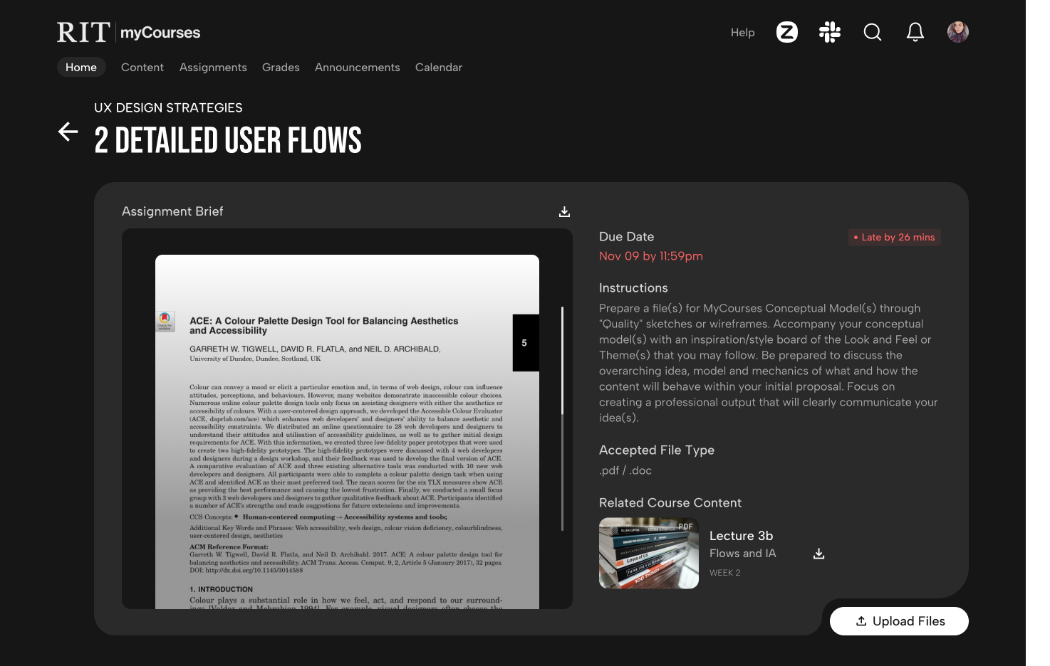
- This feature lets them view the latest assignment due, click on upload, drag file, and submit.
- Assignment cards positioned inside each course immediately give context, and also provide essential details like file format.
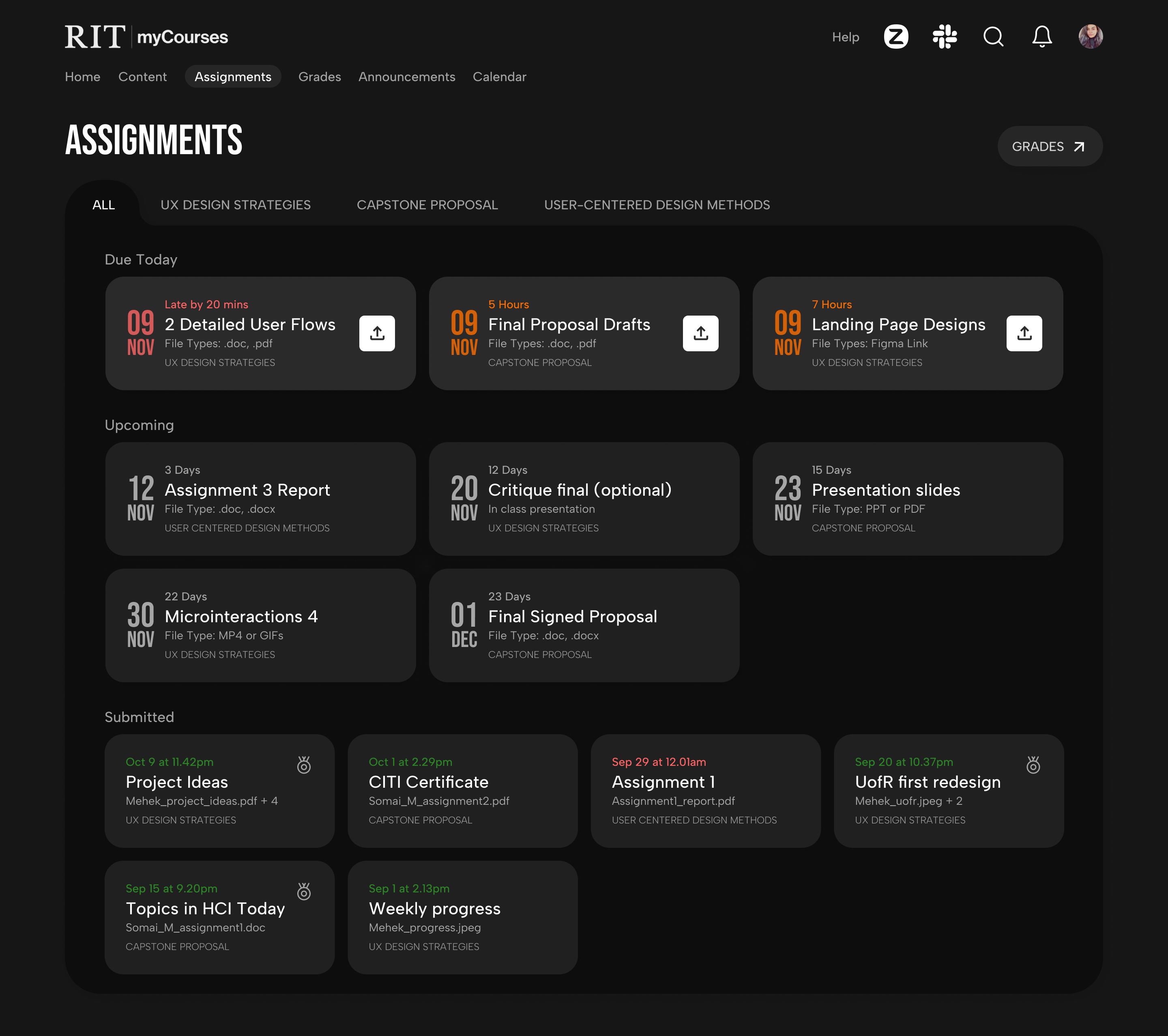
Global Assignments Page
- The central page to view all due assignments, know which are upcoming, which have been submitted, and indicators for what has been graded.
- Helps students get a better understanding of how to prioritize and plan assignments, along with a quick link to grades.
"The upload link is separate and submission/uploaded files section is separate, causing accidental clicks"— Survey Response
Consolidate Related Content
- Find assignment brief, attached documents, and upload link in the same spot - the expanded assignment card.
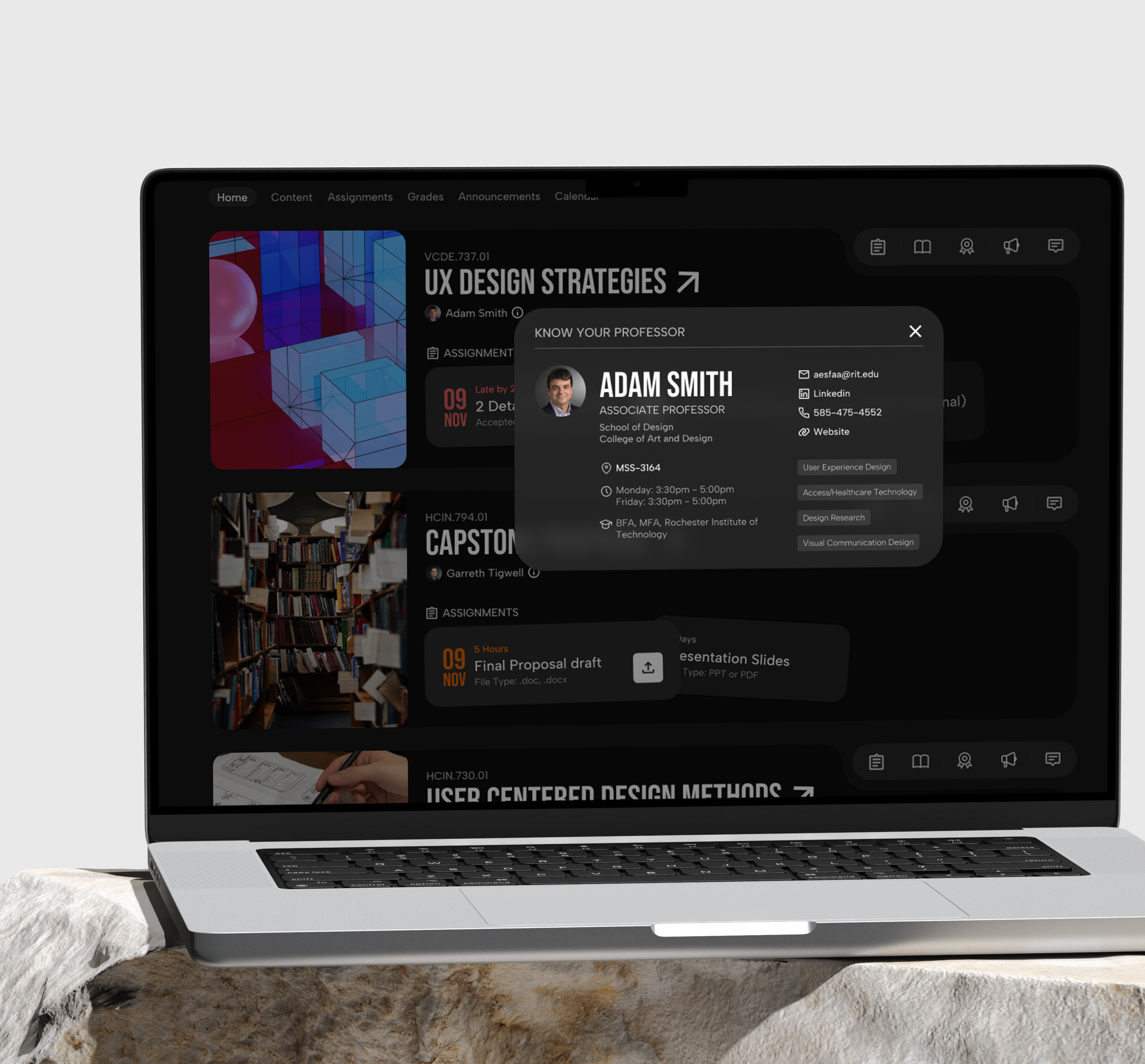
- Students can also find course content related to the assignment, saving them time navigating to the rigth file, helping them prepare faster.
5. Measure the Impact
Before and After
There was a significant difference in the user journey and architecture of both designs. The new design had lesser number of steps required in completing a task, and fewer pages to navigate to. Below are a few statistics.
clicks reduced to
0clicks
clicks reduced to
0click
A/B Testing with Users
- You have to submit an assignment for the 'Capstone Proposal' course.
- Find a PDF file on 'Usability' from the 'UX Design Strategies' course
- You want to know about the professor for your course, and find any social links to connect with them. How would you do that?
 User testing session
Test Results
Improved numbers and Positive Responses
Users loved the redesign and even wished it was developed and implemented on the actual platform.
times faster assignment uplaods.
% drop in time taken to find content
% drop in time taken to find professor details
"This is so much better, I wish it actually looked like this"
"The dark mode and colors make it so much nicer"
"Much needed update, very clean and fun looking"
Reflections
Business Impact
Improved Student Retention
A streamlined, intuitive experience helps students stay organized and reduces frustration, boosting satisfaction and retention.
Lower Support Costs
Fewer navigation issues and submission errors mean reduced reliance on IT help desks and faculty for troubleshooting.
Stronger Competitive Edge
A modern design positions the LMS as a forward-thinking, student-centric platform.
Higher Engagement with Course Material
Smart filters, content previews, and topic tagging drive more frequent and focused interactions with learning resources.
Scalable & Consistent Structure
Simplified architecture reduces content chaos across courses, making the platform easier to scale and manage institution-wide.
Future Considerations & Next Steps
Faculty & Admin Dashboards
Redesign the instructor and admin views to align with the streamlined student experience.
Advanced Features
Add flows for discussion threads, notifications, peer feedback, and calendar integrations.
Mobile Optimization
Explore mobile-specific interactions to support on-the-go coursework access.
Accessibility
Build on WCAG compliance by testing with screen readers and low-vision simulation tools.